WMU Broncos

Hello There, Guest! Registered users see far less ads! Register today and join our virtual tailgate. (Login — Register)

Post Reply 
What’s the latest on the WMU color and logo rebrand
Author Message
wmubroncopilot Online
Heisman
*

Posts: 8,948
Joined: Aug 2008
Reputation: 150
I Root For: WMU
Location: Anchorage, AK
Post: #1481
RE: What’s the latest on the WMU color and logo rebrand
(10-23-2026 12:25 PM)BroncoMinor Wrote:  
(10-23-2026 11:11 AM)wmubroncopilot Wrote:  
(10-23-2026 09:17 AM)BroncoMinor Wrote:  
(10-23-2026 08:02 AM)BroncoMD Wrote:  
(10-22-2026 09:06 PM)WesternDave Wrote:  So you are now upset they have a unified look between the entire athletic department? Or it is simply another random person out of 8 billion on this planet giving you a chance to cry about the horsie facing the wrong way with a brighter shade of yellow. The Horror! Clearly the downfall of WMU is neigh. All because of a shade of yellow. The most pathetic part is that, your preferred is also not unique among regional Universities! LOL.

Are we having the same conversation?

Enjoy your community college brand. You can buy your gear in bulk because there are racks upon racks of clearance items available! LOL!
It’s not a community college brand. That’s just you repeatedly trying to take down our school to win this argument. Go be a Purdue or Oakland U fan if you like black so much.

There were once legitimate complaints about the roll out, the use of the circle W as an athletic logo, or an inconsistent color scheme throughout our teams & facilities. That’s all gone, yet you still keep arguing the same points.

I will say that the bookstore had a ton of awful gear when I was there last month, but that’s largely the case anywhere. The worst of the circle W and garbage font stuff is long gone though. I like the colors we’re going with, the script Western Michigan is good, and the bronco head logo is perfectly fine. Not really sure what the big problem is.
I always manage to find enough Adidas Brown & Gold gear to make it work. Have we ever had a bookstore filled with amazing gear? Even in our brown, black, gray, vegas gold, white, different shade of brown, different shade of gold phase, I was never blown away by the options at the bookstore. My go to hoodie during the black years was a a black & gray sweatshirt. It had a cool ghost bronco on it that i liked. But, it was basically Raiders colors. Then I had a quarter zip with the 5 colored Bronco/W logo. It was black with brown & vegas gold accents. We had absolutely no consistent brand or color scheme during that timeframe.

People have tried to blame every shortcoming of our University, including enrollment, on Tony Proudfoot's rebrand. It's so dumb and I can't believe we're still talking about it.

We've won a national championship in hockey and had pretty meaningful success in football. We're building a new state of the art arena. The coaches all seem pretty damn good. Our new AD & Prez both seem like good representatives of the University going forward. And we have to hear alums compare us to a community college.

No I agree, I found things I liked. I don’t think the majority of stuff anywhere looks good. It’s weird, lots of garbage being made that nobody seems to buy but that’s not a WMU specific problem.

I think our branding is in a solid place since deemphasizing the circle W. I actually hope we can just stick with it (minor changes/one offs excepted) for a while instead of this every few year overhaul we always seem to have.
10-23-2026 07:38 PM
Find all posts by this user Quote this message in a reply
BroncoMD Offline
1st String
*

Posts: 1,666
Joined: May 2002
Reputation: 10
I Root For: WMU
Location:

Crappies
Post: #1482
RE: What’s the latest on the WMU color and logo rebrand
The goal was simple: Unify the academic logos with the athletic logos. A simple "technical exercise", right? This is what we were sold. Instead, WMU received a complete rebrand.

A true technical exercise would have been:

1. Make brown the primary over black.
2. Make metallic gold a primary color along with yellow gold as a legacy color.
3. Unify the W and bronco head which can be used in both academics and/or athletics -- easily separated under Dunn's branding.

The rebrand:

1. Replace a WMU created typeface with a generic looking Comic-Con like typeface.
2. Replace black with white.
3. Totally eliminate metallic gold for yellow -- although old WMU yearbook indicate otherwise.
4. Recreate the Bronco head logo and turn it east.
5. Draw a circle around the W to eliminate any sign of the WMU seal around campus.
6. And finally, eliminate the border around the block W because of reproduction -- only to later place a yellow halo around the Bronco head since it's apparently no longer an issue.

Mind you, this was all done at a time they were laying off faculty and staff and reducing the overall budget. If this doesn't impact student recruitment, why was it so important to complete in the first place?

Now, let's compare with BG: https://www.youtube.com/watch?v=q-xA1p6Nyts -- can you find something unique to BG?
(This post was last modified: 10-24-2026 08:29 AM by BroncoMD.)
10-23-2026 10:28 PM
Find all posts by this user Quote this message in a reply
BroncoMinor Offline
Heisman
*

Posts: 9,458
Joined: Jan 2017
Reputation: 71
I Root For: WMU
Location: Michigan
Post: #1483
RE: What’s the latest on the WMU color and logo rebrand
(10-23-2026 07:38 PM)wmubroncopilot Wrote:  
(10-23-2026 12:25 PM)BroncoMinor Wrote:  
(10-23-2026 11:11 AM)wmubroncopilot Wrote:  
(10-23-2026 09:17 AM)BroncoMinor Wrote:  
(10-23-2026 08:02 AM)BroncoMD Wrote:  Are we having the same conversation?

Enjoy your community college brand. You can buy your gear in bulk because there are racks upon racks of clearance items available! LOL!
It’s not a community college brand. That’s just you repeatedly trying to take down our school to win this argument. Go be a Purdue or Oakland U fan if you like black so much.

There were once legitimate complaints about the roll out, the use of the circle W as an athletic logo, or an inconsistent color scheme throughout our teams & facilities. That’s all gone, yet you still keep arguing the same points.

I will say that the bookstore had a ton of awful gear when I was there last month, but that’s largely the case anywhere. The worst of the circle W and garbage font stuff is long gone though. I like the colors we’re going with, the script Western Michigan is good, and the bronco head logo is perfectly fine. Not really sure what the big problem is.
I always manage to find enough Adidas Brown & Gold gear to make it work. Have we ever had a bookstore filled with amazing gear? Even in our brown, black, gray, vegas gold, white, different shade of brown, different shade of gold phase, I was never blown away by the options at the bookstore. My go to hoodie during the black years was a a black & gray sweatshirt. It had a cool ghost bronco on it that i liked. But, it was basically Raiders colors. Then I had a quarter zip with the 5 colored Bronco/W logo. It was black with brown & vegas gold accents. We had absolutely no consistent brand or color scheme during that timeframe.

People have tried to blame every shortcoming of our University, including enrollment, on Tony Proudfoot's rebrand. It's so dumb and I can't believe we're still talking about it.

We've won a national championship in hockey and had pretty meaningful success in football. We're building a new state of the art arena. The coaches all seem pretty damn good. Our new AD & Prez both seem like good representatives of the University going forward. And we have to hear alums compare us to a community college.

No I agree, I found things I liked. I don’t think the majority of stuff anywhere looks good. It’s weird, lots of garbage being made that nobody seems to buy but that’s not a WMU specific problem.

I think our branding is in a solid place since deemphasizing the circle W. I actually hope we can just stick with it (minor changes/one offs excepted) for a while instead of this every few year overhaul we always seem to have.
Yep, totally agree. There are always little things you can tweak to make it better. I'm not against that. But, another complete overhaul would be stupid after we've gotten so many things right. Are we going to invest in ANOTHER new football field?

I honestly don't give a **** if the Bronco faces left or right. The left facing Bronco faces west. The right facing Bronco isn't looking backwards. I can understand the argument for each side, but ultimately don't care either way. Our football helmet has one left facing Bronco & one right facing Bronco. Problem solved.

I think our uniforms across the board are great right now. This is legitimately the best hockey uniform they've ever had.
(This post was last modified: 10-23-2026 11:24 PM by BroncoMinor.)
10-23-2026 11:21 PM
Find all posts by this user Quote this message in a reply
BroncoMD Offline
1st String
*

Posts: 1,666
Joined: May 2002
Reputation: 10
I Root For: WMU
Location:

Crappies
Post: #1484
RE: What’s the latest on the WMU color and logo rebrand
I'd like to clear up some misconceptions:

1. Black. I prefer WMU brown over black -- yes, I prefer black over white as a secondary color.
2. Metallica gold. I prefer metallic gold as a compilatory color but not to completely replace yellow gold as our school colors. Should we replace metallic gold with yellow? Maybe -- but I'll explain later.
3. WMU is a great university -- not a community college. Do I believe our current BRANDING is similar to a community college? Yes, I do.
4. Athletic mark. I prefer the old athletic mark or Bronco head over the previous one. I've had conversations with other alumni who don't see a difference. The difference is in the details -- the best example I could provide is the Detroit Lions logo. Take a hard look at progression of the logo over the years -- it's all in the details. BrownandGoldLaker can back me up on this -- it's not as good as the previous logo. Direction? Yes, i prefer left or west because it's unique to WMU.

Now, let's focus on metallic gold over yellow gold. The prime example is UCLA. Their primary colors are a sky blue and a yellow gold. Yet, when it comes to athletics the gave their football program liberty to use the metallic gold -- very similar to WMU and our traditional helmets from the 50's.

[Image: jpeg-optimizer_ucla-week-3-e1757782586489.webp]

I think Proudfoot's next stop should be to UCLA. I would love to see his reception when he decides to change their look.
(This post was last modified: 10-24-2026 11:31 PM by BroncoMD.)
10-24-2026 11:23 PM
Find all posts by this user Quote this message in a reply
BroncoMinor Offline
Heisman
*

Posts: 9,458
Joined: Jan 2017
Reputation: 71
I Root For: WMU
Location: Michigan
Post: #1485
RE: What’s the latest on the WMU color and logo rebrand

(10-24-2026 11:23 PM)BroncoMD Wrote:  I'd like to clear up some misconceptions:

1. Black. I prefer WMU brown over black -- yes, I prefer black over white as a secondary color.
2. Metallica gold. I prefer metallic gold as a compilatory color but not to completely replace yellow gold as our school colors. Should we replace metallic gold with yellow? Maybe -- but I'll explain later.
3. WMU is a great university -- not a community college. Do I believe our current BRANDING is similar to a community college? Yes, I do.
4. Athletic mark. I prefer the old athletic mark or Bronco head over the previous one. I've had conversations with other alumni who don't see a difference. The difference is in the details -- the best example I could provide is the Detroit Lions logo. Take a hard look at progression of the logo over the years -- it's all in the details. BrownandGoldLaker can back me up on this -- it's not as good as the previous logo. Direction? Yes, i prefer left or west because it's unique to WMU.

Now, let's focus on metallic gold over yellow gold. The prime example is UCLA. Their primary colors are a sky blue and a yellow gold. Yet, when it comes to athletics the gave their football program liberty to use the metallic gold -- very similar to WMU and our traditional helmets from the 50's.

[Image: jpeg-optimizer_ucla-week-3-e1757782586489.webp]

I think Proudfoot's next stop should be to UCLA. I would love to see his reception when he decides to change their look.
The flaw in your argument is you define the one era in our history when we didn't wear our school colors as the norm and us returning to our school colors as
"change".

It would be like a Pistons fan claiming teal is the norm and they "changed" when they went back to red, white, and blue.

This is what the WMU Broncos look like. We went back to being the WMU Broncos.

[Image: 631d5e1b-d714-48e4-b900-bc80c9688cab-Cel...;auto=webp]

So, yes, if UCLA decided to look like Purdue, their fanbase would be upset. But, you think we should look like Purdue.
(This post was last modified: 10-25-2026 12:22 AM by BroncoMinor.)
10-24-2026 11:46 PM
Find all posts by this user Quote this message in a reply
BroncoMD Offline
1st String
*

Posts: 1,666
Joined: May 2002
Reputation: 10
I Root For: WMU
Location:

Crappies
Post: #1486
RE: What’s the latest on the WMU color and logo rebrand
(10-24-2026 11:46 PM)BroncoMinor Wrote:  
(10-24-2026 11:23 PM)BroncoMD Wrote:  I'd like to clear up some misconceptions:

1. Black. I prefer WMU brown over black -- yes, I prefer black over white as a secondary color.
2. Metallica gold. I prefer metallic gold as a compilatory color but not to completely replace yellow gold as our school colors. Should we replace metallic gold with yellow? Maybe -- but I'll explain later.
3. WMU is a great university -- not a community college. Do I believe our current BRANDING is similar to a community college? Yes, I do.
4. Athletic mark. I prefer the old athletic mark or Bronco head over the previous one. I've had conversations with other alumni who don't see a difference. The difference is in the details -- the best example I could provide is the Detroit Lions logo. Take a hard look at progression of the logo over the years -- it's all in the details. BrownandGoldLaker can back me up on this -- it's not as good as the previous logo. Direction? Yes, i prefer left or west because it's unique to WMU.

Now, let's focus on metallic gold over yellow gold. The prime example is UCLA. Their primary colors are a sky blue and a yellow gold. Yet, when it comes to athletics the gave their football program liberty to use the metallic gold -- very similar to WMU and our traditional helmets from the 50's.

[Image: jpeg-optimizer_ucla-week-3-e1757782586489.webp]

I think Proudfoot's next stop should be to UCLA. I would love to see his reception when he decides to change their look.
The flaw in your argument is you define the one era in our history when we didn't wear our school colors as the norm and us returning to our school colors as
"change".

It would be like a Pistons fan claiming teal is the norm and they "changed" when they went back to red, white, and blue.

This is what the WMU Broncos look like. We went back to being the WMU Broncos.

[Image: 631d5e1b-d714-48e4-b900-bc80c9688cab-Cel...;auto=webp]

So, yes, if UCLA decided to look like Purdue, their fanbase would be upset. But, you think we should look like Purdue.

This is not Purdue:

[Image: 1191045550.jpg.jpg?quality=90&st...4031413613]
10-27-2026 10:05 AM
Find all posts by this user Quote this message in a reply
BroncoMD Offline
1st String
*

Posts: 1,666
Joined: May 2002
Reputation: 10
I Root For: WMU
Location:

Crappies
Post: #1487
RE: What’s the latest on the WMU color and logo rebrand
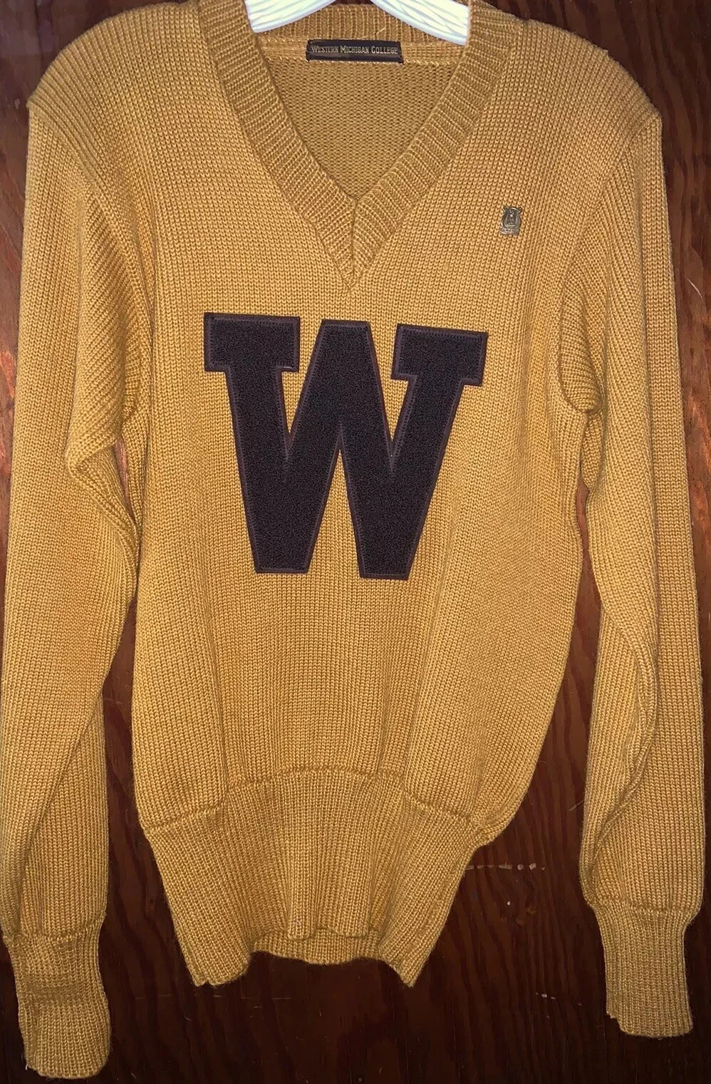
Here is a 1955 Western Michigan College varsity letter sweater:

[Image: s-l1600.webp]

Reference: https://www.ebay.com/itm/186612654388?ch...gcb5HulJu4

Brown and "old gold" -- just like ALL the old yearbooks before it. Are you still going sell me on your Pistons argument?
(This post was last modified: 10-27-2026 11:37 AM by BroncoMD.)
10-27-2026 11:36 AM
Find all posts by this user Quote this message in a reply
BroncoMinor Offline
Heisman
*

Posts: 9,458
Joined: Jan 2017
Reputation: 71
I Root For: WMU
Location: Michigan
Post: #1488
RE: What’s the latest on the WMU color and logo rebrand
(10-27-2026 11:36 AM)BroncoMD Wrote:  Here is a 1955 Western Michigan College varsity letter sweater:

[Image: s-l1600.webp]

Reference: https://www.ebay.com/itm/186612654388?ch...gcb5HulJu4

Brown and "old gold" -- just like ALL the old yearbooks before it. Are you still going sell me on your Pistons argument?
Purdue is in reference to black in case you can't figure that out.

So, my Pistons argument is tied to black.
(This post was last modified: 10-27-2026 12:01 PM by BroncoMinor.)
10-27-2026 12:00 PM
Find all posts by this user Quote this message in a reply
BroncoMD Offline
1st String
*

Posts: 1,666
Joined: May 2002
Reputation: 10
I Root For: WMU
Location:

Crappies
Post: #1489
RE: What’s the latest on the WMU color and logo rebrand
(10-27-2026 12:00 PM)BroncoMinor Wrote:  
(10-27-2026 11:36 AM)BroncoMD Wrote:  Here is a 1955 Western Michigan College varsity letter sweater:

[Image: s-l1600.webp]

Reference: https://www.ebay.com/itm/186612654388?ch...gcb5HulJu4

Brown and "old gold" -- just like ALL the old yearbooks before it. Are you still going sell me on your Pistons argument?
Purdue is in reference to black in case you can't figure that out.

So, my Pistons argument is tied to black.

Are we reading the same thread?

- Purdue = Black
- WMU = Brown
- WMU's original colors through 1977: Brown and old gold with metallic helmets early on. They changed it to brown and YELLOW from 1978 to 1997 and then switched it back to old gold with mostly metallic helmets from 1998 to 2020. Now we are back to brown and yellow. Reference: https://www.helmethistory.com/western-michigan.html
- Pistons were red, white, and blue until they changed it to Teal from 1996-2001. They went back to red, white and blue after the 2001 season.
10-28-2026 08:48 AM
Find all posts by this user Quote this message in a reply
MajorHoople Offline
Hall of Famer
*

Posts: 16,978
Joined: Apr 2007
Reputation: 185
I Root For: WMU Broncos
Location: Waldo, Read, Hyames
Post: #1490
RE: What’s the latest on the WMU color and logo rebrand
(10-28-2026 08:48 AM)BroncoMD Wrote:  WMU's original colors through 1977: Brown and old gold with metallic helmets early on. They changed it to brown and YELLOW from 1978 to 1997 and then switched it back to old gold with mostly metallic helmets from 1998 to 2020. Now we are back to brown and yellow. Reference: https://www.helmethistory.com/western-michigan.html

That's not entirely accurate.

We wore yellow jerseys for at least one football season under Merle Schlosser (circa 1959).

Doolittle changed the game pants and shoulder stripes on jerseys to yellow in 1965.

Started wearing yellow helmets in 1974.
10-28-2026 09:12 AM
Find all posts by this user Quote this message in a reply
BroncoMinor Offline
Heisman
*

Posts: 9,458
Joined: Jan 2017
Reputation: 71
I Root For: WMU
Location: Michigan
Post: #1491
RE: What’s the latest on the WMU color and logo rebrand
(10-28-2026 08:48 AM)BroncoMD Wrote:  
(10-27-2026 12:00 PM)BroncoMinor Wrote:  
(10-27-2026 11:36 AM)BroncoMD Wrote:  Here is a 1955 Western Michigan College varsity letter sweater:

[Image: s-l1600.webp]

Reference: https://www.ebay.com/itm/186612654388?ch...gcb5HulJu4

Brown and "old gold" -- just like ALL the old yearbooks before it. Are you still going sell me on your Pistons argument?
Purdue is in reference to black in case you can't figure that out.

So, my Pistons argument is tied to black.

Are we reading the same thread?

- Purdue = Black
- WMU = Brown
- WMU's original colors through 1977: Brown and old gold with metallic helmets early on. They changed it to brown and YELLOW from 1978 to 1997 and then switched it back to old gold with mostly metallic helmets from 1998 to 2020. Now we are back to brown and yellow. Reference: https://www.helmethistory.com/western-michigan.html
- Pistons were red, white, and blue until they changed it to Teal from 1996-2001. They went back to red, white and blue after the 2001 season.
Black was the primary home jersey color between 1998 & some date during the PJ era when all hell broke loose.

You pull up a brown & vegas gold jersey we wore sparingly during that time and want to claim that is the overriding artifact from that era.

I was a freshman when Tim Lester was our QB and we made the brand switch. That jersey color is called black. Notice how inconsistent the shade of gold is as we move to the Tim Hiller era.

This was back when we wore a home jersey and an away jersey and that was about it.

Tim Lester Era
[Image: WNAPITLNIADHFNY.20111024203944.jpg?width...format=jpg]

Tim Hiller Era
[Image: WSIZOZIGFJMATBE.20081112184317.jpg?width...format=jpg]

When we got to the PJ era, our brand was everything under the sun, which included those brown & vegas gold uniforms you are referencing.

The University wanted to get back to their real colors and a consistent brand. It was a bad start, but in 2026 we are there.
(This post was last modified: 10-28-2026 10:24 AM by BroncoMinor.)
10-28-2026 10:03 AM
Find all posts by this user Quote this message in a reply
BroncoMD Offline
1st String
*

Posts: 1,666
Joined: May 2002
Reputation: 10
I Root For: WMU
Location:

Crappies
Post: #1492
RE: What’s the latest on the WMU color and logo rebrand
Quote:Black was the primary home jersey color between 1998 & some date during the PJ era when all hell broke loose.

You pull up a brown & vegas gold jersey we wore sparingly during that time and want to claim that is the overriding artifact from that era.

I was a freshman when Tim Lester was our QB and we made the brand switch. That jersey color is called black. Notice how inconsistent the shade of gold is as we move to the Tim Hiller era.

This was back when we wore a home jersey and an away jersey and that was about it.

Tim Lester Era
[Image: WNAPITLNIADHFNY.20111024203944.jpg?width...format=jpg]

Tim Hiller Era
[Image: WSIZOZIGFJMATBE.20081112184317.jpg?width...format=jpg]

When we got to the PJ era, our brand was everything under the sun, which included those brown & vegas gold uniforms you are referencing.

The University wanted to get back to their real colors and a consistent brand. It was a bad start, but in 2026 we are there.

I agree with you on this. They put way too much emphasis on black versus the brown and gold over the past 20 years. Personally, I didn't mind introducing black but they did go overboard -- the Lions are doing the same thing today.

My bottom line is this: I expect excellence. As alumni, we have one college football team and I think we can all compromise on a brand that unites us.

Again, I think this is our best look:

[Image: 1191045550.jpg.jpg?quality=90&st...4031413613]

I would even remove the ghost bronco for the basic one from 2010 and change the helmets from brown to gold. Use the yellow gold and brown 80's look on special occasions. I would be fully onboard with this option.
11-01-2026 10:47 PM
Find all posts by this user Quote this message in a reply
BroncoMinor Offline
Heisman
*

Posts: 9,458
Joined: Jan 2017
Reputation: 71
I Root For: WMU
Location: Michigan
Post: #1493
RE: What’s the latest on the WMU color and logo rebrand
(11-01-2026 10:47 PM)BroncoMD Wrote:  I agree with you on this. They put way too much emphasis on black versus the brown and gold over the past 20 years. Personally, I didn't mind introducing black but they did go overboard -- the Lions are doing the same thing today.

My bottom line is this: I expect excellence. As alumni, we have one college football team and I think we can all compromise on a brand that unites us.

Again, I think this is our best look:

[Image: 1191045550.jpg.jpg?quality=90&st...4031413613]

I would even remove the ghost bronco for the basic one from 2010 and change the helmets from brown to gold. Use the yellow gold and brown 80's look on special occasions. I would be fully onboard with this option.

What about all the other sports? You're proposing a color combination that all of the other sports have never used as a primary uniform.

I think the current hockey jerseys are the best we have ever had. They are a better version of our original hockey jerseys. The colors pop. The Western Michigan script is great & has tradition behind it. I wish the Western Michigan we use on our brown road jerseys was the script for our University.

Will we now have to invest in a new football field & change all the current brown & gold branding at all the stadiums & arenas AGAIN?
(This post was last modified: 11-01-2026 11:29 PM by BroncoMinor.)
11-01-2026 11:29 PM
Find all posts by this user Quote this message in a reply
BroncoMD Offline
1st String
*

Posts: 1,666
Joined: May 2002
Reputation: 10
I Root For: WMU
Location:

Crappies
Post: #1494
RE: What’s the latest on the WMU color and logo rebrand
(11-01-2026 11:29 PM)BroncoMinor Wrote:  
(11-01-2026 10:47 PM)BroncoMD Wrote:  I agree with you on this. They put way too much emphasis on black versus the brown and gold over the past 20 years. Personally, I didn't mind introducing black but they did go overboard -- the Lions are doing the same thing today.

My bottom line is this: I expect excellence. As alumni, we have one college football team and I think we can all compromise on a brand that unites us.

Again, I think this is our best look:

[Image: 1191045550.jpg.jpg?quality=90&st...4031413613]

I would even remove the ghost bronco for the basic one from 2010 and change the helmets from brown to gold. Use the yellow gold and brown 80's look on special occasions. I would be fully onboard with this option.

What about all the other sports? You're proposing a color combination that all of the other sports have never used as a primary uniform.

I think the current hockey jerseys are the best we have ever had. They are a better version of our original hockey jerseys. The colors pop. The Western Michigan script is great & has tradition behind it. I wish the Western Michigan we use on our brown road jerseys was the script for our University.

Will we now have to invest in a new football field & change all the current brown & gold branding at all the stadiums & arenas AGAIN?

Personally, I don't think there has been enough buy-in to keep the current brand. Script jerseys are trendy -- I say keep them until they go out of style again.
11-04-2026 12:17 PM
Find all posts by this user Quote this message in a reply
Cocksman Offline
1st String
*

Posts: 1,942
Joined: Aug 2018
Reputation: 14
I Root For: WMU
Location:
Post: #1495
RE: What’s the latest on the WMU color and logo rebrand
New home basketball uni’s have a good look. I like the old school logo for these. The white and brown look with just yellowish/gold adidas logos looks great


Attached File(s)
.jpeg  IMG_2696.jpeg (Size: 55.49 KB / Downloads: 23)
(This post was last modified: 11-06-2026 10:39 AM by Cocksman.)
11-06-2026 10:38 AM
Find all posts by this user Quote this message in a reply
MajorHoople Offline
Hall of Famer
*

Posts: 16,978
Joined: Apr 2007
Reputation: 185
I Root For: WMU Broncos
Location: Waldo, Read, Hyames
Post: #1496
RE: What’s the latest on the WMU color and logo rebrand
(11-06-2026 10:38 AM)Cocksman Wrote:  New home basketball uni’s have a good look. I like the old school logo for these. The white and brown look with just yellowish/gold adidas logos looks great

Jersey is too plain.
11-06-2026 10:49 AM
Find all posts by this user Quote this message in a reply
BroncoMinor Offline
Heisman
*

Posts: 9,458
Joined: Jan 2017
Reputation: 71
I Root For: WMU
Location: Michigan
Post: #1497
RE: What’s the latest on the WMU color and logo rebrand
(11-06-2026 10:38 AM)Cocksman Wrote:  New home basketball uni’s have a good look. I like the old school logo for these. The white and brown look with just yellowish/gold adidas logos looks great

I like the home jerseys better than the road jerseys. I wish this was an alternate jersey and we kept the jerseys we were wearing last year as the primary jersey.

Looks like late 90s/early 2000s wide tank top jerseys are making a comeback.

[Image: 635715336733168064-cindc5bk-5ib7rsf01cof...;auto=webp]
(This post was last modified: 11-06-2026 11:22 AM by BroncoMinor.)
11-06-2026 11:21 AM
Find all posts by this user Quote this message in a reply
SilentStryk09 Offline
Heisman
*

Posts: 6,375
Joined: Dec 2011
Reputation: 41
I Root For: WMU
Location: Waterford, MI
Post: #1498
RE: What’s the latest on the WMU color and logo rebrand

new bball jerseys need some piping around the tank but i like em
11-06-2026 11:38 AM
Find all posts by this user Quote this message in a reply
HeatherF Offline
2nd String
*

Posts: 380
Joined: May 2019
Reputation: 12
I Root For: WMU
Location:
Post: #1499
RE: What’s the latest on the WMU color and logo rebrand
New BBall coach is like these current logos are so terrible, can we use the one from 40 years ago? And he'd be right.
Yesterday 02:01 PM
Find all posts by this user Quote this message in a reply
Post Reply 


User(s) browsing this thread: 1 Guest(s)


Copyright © 2002-2026 Collegiate Sports Nation Bulletin Board System (CSNbbs), All Rights Reserved.
CSNbbs is an independent fan site and is in no way affiliated to the NCAA or any of the schools and conferences it represents.
This site monetizes links. FTC Disclosure.
We allow third-party companies to serve ads and/or collect certain anonymous information when you visit our web site. These companies may use non-personally identifiable information (e.g., click stream information, browser type, time and date, subject of advertisements clicked or scrolled over) during your visits to this and other Web sites in order to provide advertisements about goods and services likely to be of greater interest to you. These companies typically use a cookie or third party web beacon to collect this information. To learn more about this behavioral advertising practice or to opt-out of this type of advertising, you can visit http://www.networkadvertising.org.
Powered By MyBB, © 2002-2026 MyBB Group.