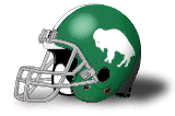
(03-13-2024 11:20 AM)DawgNBama Wrote: Got to thinking about it, and this is what I would love to see the Ducks do. Have this helmet for home games:
and this one for away games:
Oregon has completely lost their identity. You can see them on TV and 90% of the time I don't know who it is.
That *is* Oregon's identity though, and while I'm a big traditionalist otherwise, I think it works for them.
I'm just hoping the Saban era ending doesn't lead to any gimmicky Bama uniforms. One lid, one pair of pants, one home jersey, one road jersey. That's all we need.
(03-12-2024 02:16 PM)Bogg Wrote: UConn switching dogs was and remains stupid.
Definitely! The 90's Husky was iconic! And HAPPY!
Don't forget Sad Husky (1959).
Everyone left the hand drawn logos by the end of the 90’s it seemed. The UConn 2002 Husky is a pretty good update if it had to be done. The red tongue was a great touch.
The 1959 dog looks like he got caught pooping on the carpet.
(03-12-2024 01:24 PM)esayem Wrote: Iconic might be strong, and it might be my childhood nostalgia speaking, but I wanted to feature a few classics that I believe should be brought back full time. I was watching the UNLV game the other night and couldn't help but think "why did they ever change their look?"
UNLV Early 90's
Kansas Mid-90's Circus Font
UMass Mid-90's
Tennessee Early 2000's
This one might have been a throwback to the Ernie and Bernie era. For some reason I remember it. They have something similar now, minus the stylized font.
Carolina 90's V-neck
Which uniforms do you miss?
I wish Kansas State could play in their two tones more than once a season. The double lavender look is not my cup of tea.
I liked Old Dominion's look for the early to mid-90's, where an obnoxiously giant "OLD" was placed above the number on the front of the jersey, and a slightly smaller "Dominion" was underneath. Two blue shades, white, and I think a hint of gray trim? Always like that.
(03-17-2024 09:03 AM)The Cutter of Bish Wrote: I liked Old Dominion's look for the early to mid-90's, where an obnoxiously giant "OLD" was placed above the number on the front of the jersey, and a slightly smaller "Dominion" was underneath. Two blue shades, white, and I think a hint of gray trim? Always like that.
(03-17-2024 09:03 AM)The Cutter of Bish Wrote: I liked Old Dominion's look for the early to mid-90's, where an obnoxiously giant "OLD" was placed above the number on the front of the jersey, and a slightly smaller "Dominion" was underneath. Two blue shades, white, and I think a hint of gray trim? Always like that.
Hard to find
Thank you, and, yes. Even Googling Chris Gatling isn't providing great looks at the blue uniforms.
Far from iconic, but I loved Baylor's neon yellow look. Made me a fan. I also love the bright green for South Florida. I wish they would make it primary. I love it when schools go wild like that.
(03-21-2024 12:17 PM)CaliGlowin Wrote: Far from iconic, but I loved Baylor's neon yellow look. Made me a fan. I also love the bright green for South Florida. I wish they would make it primary. I love it when schools go wild like that.
I loved that uni era. I think we have one set that has some of those elements.

 /
Why Do Schools Ditch Iconic Looks?
/
Why Do Schools Ditch Iconic Looks?


![[Image: Oregon.gif]](http://www.nationalchamps.net/Helmet_Project/Oregon.gif)
![[Image: Oregon_M.gif]](http://www.nationalchamps.net/Helmet_Project/Oregon_M.gif)


![[Image: image-16.png]](https://i0.wp.com/dailycampus.com/wp-content/uploads/2021/10/image-16.png)


![[Image: ncaa-final-four-unlv-anderson-hunt-in-ac...Dt5e8BU6c=]](https://media.gettyimages.com/id/119070317/photo/ncaa-final-four-unlv-anderson-hunt-in-action-vs-duke-at-mcnichols-sports-arena-denver-co-4-2.jpg?s=612x612&w=0&k=20&c=4ut6xiC5rEL_L_-Uf6xWw-O3ZhL6-RKU0eDt5e8BU6c=)
![[Image: irvine-guard-stacey-augmon-of-the-unlv-r...tMaoY-zus=]](https://media.gettyimages.com/id/1395834/photo/irvine-guard-stacey-augmon-of-the-unlv-running-rebels-dunks-during-a-game-against-the-university.jpg?s=612x612&w=0&k=20&c=DWEU5NzXT365diwKceFj1qLW9qm6pMjdputMaoY-zus=)
![[Image: university-of-kansas-guard-jacque-vaughn...uRlMURBdc=]](https://media.gettyimages.com/id/281792/photo/university-of-kansas-guard-jacque-vaughn-during-the-jayhawks-81-75-win-over-umass-in-the-john.jpg?s=612x612&w=0&k=20&c=zb-iYtD4gq6GMnr1fCVOQMUSZvZwOcdobIuRlMURBdc=)
![[Image: forward-lou-roe-of-the-massachusetts-min...Yp3-ycRLs=]](https://media.gettyimages.com/id/310677/photo/forward-lou-roe-of-the-massachusetts-minutemen-goes-up-for-the-ball-during-a-game-against-the.jpg?s=612x612&w=0&k=20&c=44DyOsjF7lSM06NwnL8rmeoVOBkUiEgKYKYp3-ycRLs=)
![[Image: center-marcus-camby-of-the-massachusetts...9N8NkI3nU=]](https://media.gettyimages.com/id/72441933/photo/center-marcus-camby-of-the-massachusetts-minutemen-stands-guard-under-the-basket-for-any-kansas.jpg?s=612x612&w=0&k=20&c=P1op4jT6WGbGGDM0h53A6AAOi8lhvwWOU29N8NkI3nU=)
![[Image: TN_Ron-Slay.jpg]](https://a.espncdn.com/combiner/i?img=/photo/2017/0301/TN_Ron-Slay.jpg)
![[Image: united-states-coll-basketball-kentuckys-...KSQXp1rxQ=]](https://media.gettyimages.com/id/81375479/photo/united-states-coll-basketball-kentuckys-cliff-hawkins-in-action-vs-tennessees-jon-higgins.jpg?s=612x612&w=0&k=20&c=byWIHDN9LAGrbWul3MOLC1zoI_y8BeTnywKSQXp1rxQ=)
![[Image: jerry-stackhouse-rubs-the-head-of-rashee...rb4TYUsGE=]](https://media.gettyimages.com/id/281566/photo/jerry-stackhouse-rubs-the-head-of-rasheed-wallace-both-of-north-carolina-during-the-final-minute.jpg?s=612x612&w=0&k=20&c=mMu_nJsrCBM0fy7vnoxtl-jyMN8WaHQQTCrb4TYUsGE=)
![[Image: north-carolina-eric-montross-on-court-du...MVcz9YV80=]](https://media.gettyimages.com/id/107561046/photo/north-carolina-eric-montross-on-court-during-game-vs-wake-forest-at-dean-smith-center-chapel.jpg?s=612x612&w=0&k=20&c=sr2Uq8HmgNmoiityIn6DF9njsa3JDGr1YAMVcz9YV80=)


![[Image: 652274762.jpg]](https://cdn.vox-cdn.com/thumbor/B6ErD4ZVt43imxLj6Jf1qQOIMTc=/0x0:3000x2216/920x0/filters:focal(0x0:3000x2216):format(webp):no_upscale()/cdn.vox-cdn.com/uploads/chorus_asset/file/23431935/652274762.jpg)
![[Image: aHR0cHM6Ly9maWdodGluZ2lyaXNoLmNvbS93cC1j...C5qcGc.jpg]](https://fightingirish.com/imgproxy/P-7lh03WgAOf-exKBWuH2QKm-d45zqBoW0P-hxIsEr0/fit/1920/1080/ce/0/aHR0cHM6Ly9maWdodGluZ2lyaXNoLmNvbS93cC1jb250ZW50L3VwbG9hZHMvMjAyMC8wMi90cmlwdWNrYS0xNC5qcGc.jpg)
![[Image: aHR0cHM6Ly9maWdodGluZ2lyaXNoLmNvbS93cC1j...LmpwZw.jpg]](https://fightingirish.com/imgproxy/HEq65jnsxhx5XlpmVaguwazMaxvTUm30anooARqGsi4/fit/517/1024/ce/0/aHR0cHM6Ly9maWdodGluZ2lyaXNoLmNvbS93cC1jb250ZW50L3VwbG9hZHMvMjAxOS8xMC9UcmlwdWNrYS0xLmpwZw.jpg)

![[Image: cincinnati-kenyon-martin-of-the-cincinna...fi5Xc5lo4=]](https://media.gettyimages.com/id/51073427/photo/cincinnati-kenyon-martin-of-the-cincinnati-bearcats-makes-a-jump-shot-during-a-game-against.jpg?s=612x612&w=0&k=20&c=smmbFSIDhPO3-fXJRE_qhSOOfp6tnzRDZRfi5Xc5lo4=)
![[Image: darnell-burton-of-cincinnati-university-...HEYc6kOCI=]](https://media.gettyimages.com/id/354975/photo/darnell-burton-of-cincinnati-university-playes-defense-during-the-bearcats-76-56-win-over-south.jpg?s=612x612&w=0&k=20&c=jaZlc3nWgq4hRq9s9hD_uSmSupifAcarYoHEYc6kOCI=)
![[Image: PDCMYCBVXYOUVQD.20130606093810.jpeg]](https://dxbhsrqyrr690.cloudfront.net/sidearm.nextgen.sites/odusports.com/images/2013/6/6/PDCMYCBVXYOUVQD.20130606093810.jpeg)

![[Image: UConn-Jersey-1-Front_400x400.jpg?v=1709235266]](https://www.homefieldapparel.com/cdn/shop/files/UConn-Jersey-1-Front_400x400.jpg?v=1709235266)

![[Image: D4C5KJCWsAAcAAQ.jpg?format=1500w]](https://images.squarespace-cdn.com/content/v1/5ab4527b3c3a536a7a352c05/1555174141332-KUH3UJ0062ZFXXLSP8RH/D4C5KJCWsAAcAAQ.jpg?format=1500w)
![[Image: 40996---cover-thumbnail-image.jpg]](https://vault.si.com/.image/t_share/MTY5MDk4NjM3ODMyNjI3NDg5/40996---cover-thumbnail-image.jpg)