Check Yosef

1st String


Posts: 2,057
Joined: Aug 2013
Reputation: 28
I Root For: App State
Location: |
RE: App State fans
Both I'm not the biggest fan of, Block A is good by me.
Sent from my LGLS992 using CSNbbs mobile app
|
|
| 11-14-2017 09:25 PM |
|
southcharlotteapp
1st String

Posts: 1,192
Joined: Sep 2014
Reputation: 145
I Root For: Appalachian
Location: Charlotte, NC |
RE: App State fans
(11-14-2017 07:53 PM)Limebull Wrote: (11-14-2017 06:16 PM)hendoapp Wrote: This is a joke correct?
No. The first one to me is so much better. It has a modern design and is clever. I mean it has a freaking mountain for the beard. The second one looks like a five year old tried to draw a Simpsons character, utter garbage.
That logo has been around a hell of a lot longer than The Simpsons.
While we're on the topic, did USF have to pay copyrights to the Spurs for this logo?
![[Image: 201412a.jpg]](https://s1.ticketm.net/tm/en-us/dbimages/201412a.jpg)
![[Image: 413XBJYWEOL.jpg]](https://images-na.ssl-images-amazon.com/images/I/413XBJYWEOL.jpg)
|
|
| 11-14-2017 09:28 PM |
|
southcharlotteapp
1st String
Posts: 1,192
Joined: Sep 2014
Reputation: 145
I Root For: Appalachian
Location: Charlotte, NC |
|
| 11-14-2017 09:35 PM |
|
BurlingtonApp

1st String
Posts: 2,022
Joined: May 2013
Reputation: 62
I Root For: App State
Location: |
RE: App State fans
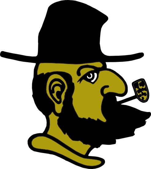
The Block A is #1, but between these two, it's Victory Yosef (the one on the right) by a mile. The left is horrible, and doesn't look good on any apparel.
|
|
| 11-14-2017 10:22 PM |
|
T-Dog
SunBeltbbs App State INsider

Posts: 2,556
Joined: Jul 2012
Reputation: 224
I Root For: App State
Location: The High Country |
RE: App State fans
The logo on the left, Gorton's Fisherman, was forced by some New York design firm in the late 90s. It looked like every other logo.
Corn Cob Pipe Yosef was left to die, until it started appearing in the back of someone's car, then in King Street apparel shops and soon enough, it was everywhere except on ASU jerseys. Then in 2011-12, App reclaimed its original copyright and made it the "vintage" logo for a limited time.
A year later, after literally everything with CCP Yosef sold out, the vintage logo became the secondary logo and the Fisherman's head was dropped.
After the change back to the old school, every design blogger and mocha-sipping hipster blasted App for going to a "cartoon" logo. I wrote a lot of those clowns via email or comments.
If the Fisherman's head logo is so awesome, modern and sleek, why did not one buy it and buy the "cartoon" logo in droves instead?
Money talks and bull**** walks.
|
|
| 11-14-2017 10:49 PM |
|
AppManDG
Heisman

Posts: 6,134
Joined: Aug 2010
Reputation: 308
I Root For: App State
Location: Gastonia, NC |
RE: App State fans
(11-14-2017 10:49 PM)T-Dog Wrote: The logo on the left, Gorton's Fisherman, was forced by some New York design firm in the late 90s. It looked like every other logo.
Corn Cob Pipe Yosef was left to die, until it started appearing in the back of someone's car, then in King Street apparel shops and soon enough, it was everywhere except on ASU jerseys. Then in 2011-12, App reclaimed its original copyright and made it the "vintage" logo for a limited time.
A year later, after literally everything with CCP Yosef sold out, the vintage logo became the secondary logo and the Fisherman's head was dropped.
After the change back to the old school, every design blogger and mocha-sipping hipster blasted App for going to a "cartoon" logo. I wrote a lot of those clowns via email or comments.
If the Fisherman's head logo is so awesome, modern and sleek, why did not one buy it and buy the "cartoon" logo in droves instead?
Money talks and bull**** walks.
Wonder who's car it started appearing on?
Sent from my XT1635-01 using CSNbbs mobile app
|
|
| 11-14-2017 11:10 PM |
|
SLewis
Bench Warmer

Posts: 238
Joined: Oct 2015
Reputation: 7
I Root For: App State
Location: |
RE: App State fans
That perpendicular eye looking out of the Right Logo has never sat right with me, but it's still preferred over the Left logo.
|
|
| 11-14-2017 11:21 PM |
|
CheckYosef94
2nd String


Posts: 415
Joined: Nov 2014
Reputation: 56
I Root For: App State
Location: |
|
| 11-15-2017 12:53 AM |
|
panama
Legend


Posts: 31,353
Joined: May 2009
Reputation: 633
I Root For: Georgia STATE
Location: East Atlanta Village |
RE: App State fans
(11-14-2017 05:51 PM)Limebull Wrote: Which logo do you guys like more? Personally I like the left, it's shame they got rid of it. It was one of the best logos in college football.
![[Image: 9347058_1280x720.jpg]](http://cdn.abclocal.go.com/images/wtvd/cms_exf_2007/automation/images/9347058_1280x720.jpg)
Left is good but if I saw it in a vacuum I would think WVU. Right screams App.
Sent from my SM-G955U using Tapatalk
|
|
| 11-15-2017 07:11 AM |
|
asuwon
Special Teams


Posts: 959
Joined: May 2002
Reputation: 66
I Root For: Arkansas State
Location: |
RE: App State fans
I prefer the one on the right.
|
|
| 11-15-2017 08:17 AM |
|
AppNation85
Bench Warmer

Posts: 167
Joined: Sep 2017
Reputation: 11
I Root For: Appalachian State
Location: |
App State fans
Block A but I went to school when we had the one on the left and to me that’s still the logo. I have no attachment to the one on the right.
|
|
| 11-15-2017 08:28 AM |
|
ManOnABuffalo
Sun Belt Nationalist

Posts: 2,922
Joined: Feb 2012
Reputation: 98
I Root For: Appalachian St.
Location: In the Gym |
RE: App State fans
(11-14-2017 07:52 PM)AppManDG Wrote: (11-14-2017 06:39 PM)ManOnABuffalo Wrote: Right, and most real App St fans will generally agree. Lots more history with that logo.
The one on the left, also known as the Morton's Fisherman is for Walmart type App St fans and gear.
It's Gorton's Fisherman.
It's the dude on the frozen seafood box. 
|
|
| 11-15-2017 08:39 AM |
|
GSUALUM17
All American

Posts: 4,056
Joined: Sep 2017
Reputation: 149
I Root For: GSU
Location: |
RE: App State fans
![[Image: s-l225.jpg]](https://i.ebayimg.com/thumbs/images/g/7ZIAAOSwal5YIBz~/s-l225.jpg)
Christmas gift idea for App fans 
lol jk
|
|
| 11-15-2017 08:43 AM |
|
AppManDG
Heisman
Posts: 6,134
Joined: Aug 2010
Reputation: 308
I Root For: App State
Location: Gastonia, NC |
RE: App State fans
(11-14-2017 09:25 PM)Check Yosef Wrote: Both I'm not the biggest fan of, Block A is good by me.
Sent from my LGLS992 using CSNbbs mobile app
How can someone with the name "Check Yosef" not be a fan of a Yosef logo?
|
|
| 11-15-2017 09:35 AM |
|
AppManDG
Heisman
Posts: 6,134
Joined: Aug 2010
Reputation: 308
I Root For: App State
Location: Gastonia, NC |
RE: App State fans
(11-15-2017 08:39 AM)ManOnABuffalo Wrote: (11-14-2017 07:52 PM)AppManDG Wrote: (11-14-2017 06:39 PM)ManOnABuffalo Wrote: Right, and most real App St fans will generally agree. Lots more history with that logo.
The one on the left, also known as the Morton's Fisherman is for Walmart type App St fans and gear.
It's Gorton's Fisherman.
It's the dude on the frozen seafood box.
That's the guy!
|
|
| 11-15-2017 09:37 AM |
|
Duncan20
Bench Warmer

Posts: 117
Joined: Apr 2013
Reputation: 8
I Root For: App State
Location: Huntersville,NC |
RE: App State fans
I don't hate the one on the left, I liked the idea of trying to get a grandfather mountain type yosef logo (it didn't work), but I prefer victory yosef. My favorite is the Block A , most of my gear has that on it with victory Yosef catching up.
|
|
| 11-15-2017 09:51 AM |
|
TrueBlueDrew
Heisman

Posts: 6,553
Joined: Jun 2014
Reputation: 486
I Root For: Jawjuh Suthen
Location: Enemy Turf |
RE: App State fans
The victory Yosef looks like it was made with Microsoft paint. The other one isn’t that great either. I’m glad y’all mainly use the A
|
|
| 11-15-2017 09:55 AM |
|
AppManDG
Heisman
Posts: 6,134
Joined: Aug 2010
Reputation: 308
I Root For: App State
Location: Gastonia, NC |
RE: App State fans
(11-15-2017 08:28 AM)AppNation85 Wrote: Block A but I went to school when we had the one on the left and to me that’s still the logo. I have no attachment to the one on the right.
The one on the left was the result of the logo updating craze of the 90's. Everyone wanted bold images with sharp edges. At the time our administration had been infiltrated with northern liberal administrators who thought the old logo was too country and projected a hillbilly image of the school. Problem is they didn't understand how much our alumni cherish and embraced the mountain heritage of the school.
Myself and several of my old school buddies really disliked the new logo. The old logo had never been copyrighted so I had some car magnets made up. People began asking where they could get one so I had a hunderd made and put the word out I'd be selling them at my tailgate before the 1st national championship game. I sold out in less than a hour. Next season I had several hunderd more made and sold them before the 3rd game and did the same again before the end of the seaosn. The next year a internet company in Boone jumped on the success of my magnet sales and started selling caps & shirts with it. I wasn't in it for the money and didn't care since my motive was to get rid of the Gorton's Fisherman logo by whatever means possible. My college roommate owns a ASU merchandise store in Boone and he also started using it. Once the school realized how much money they were losing they moved to copyright the logo and make it one of our primary logo's. The official one iisn't exactly like the one I had been printing. It is the original 1973 logo and mine was the one that had been touched up a little and used on our helmets in 1975. Eithereay, Mission Accomplished!
I like the Block A. At first I was resistant to the Black one, but have come to really like it. IMO, both logo's have their own place.
(This post was last modified: 11-15-2017 10:18 AM by AppManDG.)
|
|
| 11-15-2017 10:13 AM |
|
Fanther
Bench Warmer
Posts: 168
Joined: Mar 2014
Reputation: 2
I Root For: GSU
Location: |
RE: App State fans
The Mountaineer figure looks like a failed attempt to be goofier than the Wake Forest Demon Deacon figure. Stick with the safe Block "A".
(This post was last modified: 11-15-2017 10:23 AM by Fanther.)
|
|
| 11-15-2017 10:23 AM |
|
AppManDG
Heisman
Posts: 6,134
Joined: Aug 2010
Reputation: 308
I Root For: App State
Location: Gastonia, NC |
RE: App State fans
No offense, but we App Fans really don't care what any of you think.
|
|
| 11-15-2017 10:42 AM |
|


![[Image: 7ri3E9a.png]](http://i.imgur.com/7ri3E9a.png)
