NIU75

All American

Posts: 3,199
Joined: Nov 2011
Reputation: 15
I Root For: NIU
Location: |
|
| 05-12-2019 10:21 AM |
|
niu1980
2nd String


Posts: 427
Joined: Nov 2002
Reputation: 10
I Root For: NIU
Location: |
|
| 05-12-2019 10:41 AM |
|
Dog Fan
Hall of Famer


Posts: 24,905
Joined: Dec 2003
Reputation: 145
I Root For: NIU Huskies
Location: The Paperback Grotto

|
|
| 05-12-2019 10:43 AM |
|
JoeNovak
1st String


Posts: 1,160
Joined: Jan 2016
Reputation: 6
I Root For: NIU
Location: |
RE: Logo
(05-12-2019 10:21 AM)NIU75 Wrote: Is it time for a change?
https://herosports.com/college-football/...-tech-ahah
This guy has no clue... Hawaii and Memphis are fine. I agree with Arizona State and Oregon State logos sucking compared to what they used to be. We are all biased but I love that NIU logo. It should go back on the helmets damn it!!
|
|
| 05-12-2019 10:56 AM |
|
IWokeUpLikeThis

Hall of Famer

Posts: 13,886
Joined: Jul 2014
Reputation: 1484
I Root For: NIU, Chicago St
Location: |
RE: Logo
My generation has a knack for being “marketing consultants” who take teams’ unique logos and turn them into something forgettable and generic.
Never hire a “marketing consultant” or “business consultant” or “branding consultant”. Ever.
|
|
| 05-12-2019 11:04 AM |
|
prairiedawg
All American

Posts: 3,869
Joined: Jul 2004
Reputation: 13
I Root For: NIU HUSKIES
Location: |
RE: Logo
I love that logo. No, dont change thing...just put it on the helmets please.
|
|
| 05-12-2019 11:28 AM |
|
Big_Man
Destroyer

Posts: 2,697
Joined: Feb 2007
Reputation: 23
I Root For: Chicago
Location: |
RE: Logo
I've always thought the Huskie head with the logo was a bit much. I prefer just the head, or just "NIU" or a new logo that just says "Northern". I don't really like "Northern Illinois" or No. Illinois or N. Illinois.
|
|
| 05-12-2019 11:44 AM |
|
Rabid Squirrel
Heisman

Posts: 7,332
Joined: Feb 2014
Reputation: 40
I Root For: NIU Huskies
Location: St.charles, IL |
RE: Logo
GOOD MAC
Ohio, NIU, Miami, Kent
BAD MAC
CMU, Akr, WMU, BGU, BSU
MYEH MAC
Tol, EMU, Buff
But I still prefer the N with the I through it. Classic look.
|
|
| 05-12-2019 11:50 AM |
|
HuskieDave
All American
Posts: 3,864
Joined: Mar 2003
Reputation: 19
I Root For: The NIU Huskies
Location: Homer Glen, Illinois |
RE: Logo
(05-12-2019 11:50 AM)Rabid Squirrel Wrote: GOOD MAC
Ohio, NIU, Miami, Kent
BAD MAC
CMU, Akr, WMU, BGU, BSU
MYEH MAC
Tol, EMU, Buff
But I still prefer the N with the I through it. Classic look.
The interlocking N and I, PLEASE.
|
|
| 05-12-2019 12:05 PM |
|
Beach Boy
Bench Warmer

Posts: 176
Joined: Dec 2018
Reputation: 0
I Root For: NIU Huskies
Location: |
RE: Logo
Piss on this guy. The current logo has everything.
The logo of the Huskie only head lacks the "NIU" needed to show who were.
The logo of "NIU" only leaves out the Huskie. And we are Huskies.
Leave the logo alone. It's much better than many of the ones in the article.
|
|
| 05-12-2019 01:17 PM |
|
NILAW
Moderator


Posts: 4,019
Joined: Oct 2013
Reputation: 24
I Root For: NIU
Location: Naperville |
RE: Logo
(05-12-2019 10:56 AM)JoeNovak Wrote: (05-12-2019 10:21 AM)NIU75 Wrote: Is it time for a change?
https://herosports.com/college-football/...-tech-ahah
This guy has no clue... Hawaii and Memphis are fine. I agree with Arizona State and Oregon State logos sucking compared to what they used to be. We are all biased but I love that NIU logo. It should go back on the helmets damn it!!
Agreed.
|
|
| 05-12-2019 01:28 PM |
|
uiniu57
All American
Posts: 3,011
Joined: Feb 2010
Reputation: 29
I Root For: Amanda Sauer
Location: Frozen part of hell |
RE: Logo
Do a search for Andrew Doughty and it doesn't bring up this hack blogger. The first six entries are all about a well-respected author and expert on Hawaii.
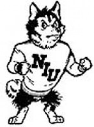
As for this douche bag who has zero qualifications for reviewing logos, he simply fits the description that opinions are like a**holes, everyone has one, some are simply smelly, and many are full of s**t. Fully agree with everyone who is in favor of that logo being on our helmets. It's a unique type font, it identifies the school and the nickname in one, which is unlike so many previous attempts -- cartoonish boxer, wolf's head, running dog -- that failed to achieve that in one way or another. Whether you want to say our success coincides with this logo or the logo has coincided with our success, it's become readily recognized by real college football fans.
|
|
| 05-12-2019 02:55 PM |
|
Skinut
1st String
Posts: 1,042
Joined: Aug 2013
Reputation: 8
I Root For: NIU
Location: All Over the Place |
RE: Logo
Love the logo. The author does really bad drugs.
|
|
| 05-12-2019 04:51 PM |
|
randyfensfanclub1
All American

Posts: 4,947
Joined: Sep 2008
Reputation: 45
I Root For: NIU
Location: |
RE: Logo
8 worst logos needing a makeover?
I do admit the school name, mascot and nickname all in one is a little much. But let's be honest, it's out of necessity for recognition.
The logic may be be an a$$backwards attempt at a compliment. Like they don't need all that jazz to be recognized. Maybe NIU is more recognizable than we think.
|
|
| 05-12-2019 07:47 PM |
|
pvk75
All American

Posts: 3,470
Joined: Jan 2018
Reputation: 104
I Root For: NIU, MAC
Location: |
RE: Logo
(05-12-2019 02:55 PM)uiniu57 Wrote: Do a search for Andrew Doughty and it doesn't bring up this hack blogger. The first six entries are all about a well-respected author and expert on Hawaii.
As for this douche bag who has zero qualifications for reviewing logos, he simply fits the description that opinions are like a**holes, everyone has one, some are simply smelly, and many are full of s**t. Fully agree with everyone who is in favor of that logo being on our helmets. It's a unique type font, it identifies the school and the nickname in one, which is unlike so many previous attempts -- cartoonish boxer, wolf's head, running dog -- that failed to achieve that in one way or another. Whether you want to say our success coincides with this logo or the logo has coincided with our success, it's become readily recognized by real college football fans.
+1. Whoever this guy Doughty is -- Hawaii or not -- he's been inhaling too much volcano gas. Much as I could care less about Northwestern, if it saw the need for change, it would. So would NIU. It's not up to Doughty, who writes a lot like a guy who has nothing else to do in the off-season. "If it ain't broke, don't fix it."
(This post was last modified: 05-13-2019 04:07 AM by pvk75.)
|
|
| 05-12-2019 08:29 PM |
|
NIU007
Legend


Posts: 34,300
Joined: Sep 2004
Reputation: 318
I Root For: NIU, MAC
Location: Naperville, IL |
RE: Logo
I really like the current logo - to me it's the best one they've had, though the intersecting N and I was pretty good - a little too similar to Indiana though.
|
|
| 05-13-2019 11:29 AM |
|
DogTracks
Heisman
Posts: 5,839
Joined: Jul 2002
Reputation: 7
I Root For:
Location: |
RE: Logo
It's fine, but it's also bit dated and could use a refresh.
|
|
| 05-13-2019 12:13 PM |
|
Big Red
All American
Posts: 4,577
Joined: Sep 2008
Reputation: 52
I Root For: NIU
Location: |
RE: Logo
I've always felt the MAC football helmets were all Arena League level in terms of their logo/decals.
College football is typically pretty basic or simplistic in their more iconic helmet logos. The MAC has, for the most part, a bunch of graphic and pictures on their helmets. I've never been a huge fan.
|
|
| 05-13-2019 12:14 PM |
|
NIU007
Legend
Posts: 34,300
Joined: Sep 2004
Reputation: 318
I Root For: NIU, MAC
Location: Naperville, IL |
RE: Logo
I like the Huskie head AND the NIU so people watching start to associate the huskie head logo with NIU. I guess it does look a bit "arena-league" but I don't mind, at least for now.
|
|
| 05-13-2019 02:07 PM |
|
chihuskie
Heisman
Posts: 5,101
Joined: Aug 2004
Reputation: 40
I Root For: NIU Huskies
Location: |
|
| 05-13-2019 02:27 PM |
|


