billymac

Heisman

Posts: 6,014
Joined: Aug 2014
Reputation: 122
I Root For: William & Mary
Location: |
RE: "Reinvigorated" Mark & Brand Coming on Wednesday
The discussion started by WMSB, over on the JMU board, also has a much more logical feel to it than on our board.
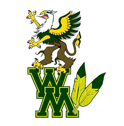
I do agree, the bright yellow with bright white logo is just is too hard to differentiate, making it sort of blobby looking.
I do like the look on the smaller scale use (ball cap, left chest logo on jackets).
|
|
| 07-26-2018 09:12 AM |
|
Tribeheart

Heisman
Posts: 6,847
Joined: Oct 2013
Reputation: 53
I Root For: William & Mary
Location: Richmond |
RE: "Reinvigorated" Mark & Brand Coming on Wednesday
Always opportunities to tweak and improve over time.
If we find ourselves relevant again in football, see the basketball program get the emphasis it deserves, and continue to see gameday fan experience improvements, then Ms. Huge can make the logo whatever she wants and I would be perfectly happy.
Sent from my SM-N910V using CSNbbs mobile app
(This post was last modified: 07-26-2018 09:50 AM by Tribeheart.)
|
|
| 07-26-2018 09:39 AM |
|
Mrs. Got Ribe
1st String


Posts: 1,869
Joined: Jul 2014
Reputation: 31
I Root For: The Tribe
Location: Bridgewater, VA |
RE: "Reinvigorated" Mark & Brand Coming on Wednesday
(07-26-2018 09:12 AM)billymac Wrote: The discussion started by WMSB, over on the JMU board, also has a much more logical feel to it than on our board.
I do agree, the bright yellow with bright white logo is just is too hard to differentiate, making it sort of blobby looking.
I do like the look on the smaller scale use (ball cap, left chest logo on jackets).
The yellow logo outlined with silver becomes a blob, especially on a green background. Maybe a black outline would provide more contrast?
|
|
| 07-26-2018 09:41 AM |
|
billymac
Heisman
Posts: 6,014
Joined: Aug 2014
Reputation: 122
I Root For: William & Mary
Location: |
RE: "Reinvigorated" Mark & Brand Coming on Wednesday
(07-26-2018 09:41 AM)Mrs. Got Ribe Wrote: (07-26-2018 09:12 AM)billymac Wrote: The discussion started by WMSB, over on the JMU board, also has a much more logical feel to it than on our board.
I do agree, the bright yellow with bright white logo is just is too hard to differentiate, making it sort of blobby looking.
I do like the look on the smaller scale use (ball cap, left chest logo on jackets).
The yellow logo outlined with silver becomes a blob, especially on a green background. Maybe a black outline would provide more contrast?
That was my first thought, as well.
|
|
| 07-26-2018 10:16 AM |
|
LeadBolt
All American


Posts: 3,409
Joined: Apr 2013
Reputation: 75
I Root For: William & Mary
Location: Botetourt |
RE: "Reinvigorated" Mark & Brand Coming on Wednesday
(07-26-2018 09:39 AM)Tribeheart Wrote: Always opportunities to tweak and improve over time.
If we find ourselves relevant again in football, see the basketball program get the emphasis it deserves, and continue to see gameday fan experience improvements, then Ms. Huge can make the logo whatever she wants and I would be perfectly happy.
Sent from my SM-N910V using CSNbbs mobile app
I have to agree. Logos come and go and are tweaked overtime. I have definite preferences for a logo that won't happen.
I like the ampersand being included, but I'm not wild about the font. I think that we could all see the Griffin coming. If it inspires the current generation and motivates the athletes, great.
That being said, the highlighted part above, regaining relevance in FB, going to the dance in mbb & wbb and an improved game day experience are the priorities that excite me much more than a logo.
|
|
| 07-26-2018 10:23 AM |
|
2017WithPep
Water Engineer

Posts: 96
Joined: Mar 2018
Reputation: 3
I Root For: William & Mary and JMU
Location: |
RE: "Reinvigorated" Mark & Brand Coming on Wednesday
(07-25-2018 12:28 PM)zablenoise Wrote: (07-25-2018 11:34 AM)2017WithPep Wrote: Personally not a fan at all. Like a lot of people I don't like the look - it somehow manages to look too busy but also too cartoonish. More importantly though, I feel like we have too many logos. If we want recognition we need to keep it to just a few. It's already confusing that we used to be called the Indians, then the Tribe, but our mascot is a Griffin, and then the logo changed from feathers to no feathers, then we have a cypher, a normal logo, and now this new one. I agree with the idea that we need the full name out there for marketing purposes and brand building, not just W&M. But surely having like three or four different looking W&Ms out there makes it even less viable.
For what it is worth, it is being received poorly by the student body.
Edit: I also feel the ampersand is unusual looking enough to potentially be mistaken for an E, especially if see quickly during a game.
Edit again: The new logos are being widely mocked by the study body, including comparisons to high school logos, and comparisons of the Griffin's body to a chicken wing. It has become a bit of a meme already.
That is really too bad. Have you heard any positive feedback from current students?
Not much. Admittedly, since the old Overheard group was shut down by it's founders on Facebook, the main place a large number of students comment online is on a meme page related to the school, so the purpose of the page is generally to be amusing. With that said, the new logo has drawn comparisons to Ihop changing its logo (change for no reason), criticism because we paid somebody to do this when money could have gone elsewhere (not sure how true this is, but the idea has taken off), and a post where somebody says they made a better new logo in 30 seconds in a program similar to Microsoft Paint. That post is, of course, somewhat in jest, but it has 500 likes and pretty much summarizes how students feel. Also the new Griffin's body was also compared to a chicken wing shape, for what that's worth. I'm not sure how to upload pictures on by just uploading them rather than through a url.
|
|
| 07-26-2018 12:09 PM |
|
DSL
2nd String

Posts: 255
Joined: Mar 2017
Reputation: 12
I Root For: Tribe
Location: |
RE: "Reinvigorated" Mark & Brand Coming on Wednesday
I was surprised to find lots of the new logo merchandise in the bookstore and campus shop this morning. I was shopping for the remaining Tribe script items. There are some nice Tribe jackets in the clearance section upstairs at the bookstore. Bookstore and campus shop employees said customers were not speaking kindly of the new look of the W&M letters. In recent years, I have been able to buy merchandise with our former logos from the Quarterback Club.
|
|
| 07-26-2018 12:49 PM |
|
Tribal
Moderator


Posts: 11,865
Joined: Oct 2011
Reputation: 162
I Root For: William & Mary
Location: |
"Reinvigorated" Mark & Brand Coming on Wednesday
If someone likes it, they like it. If they hate it, they hate it. Logos are open to subjectivity.
And, permanent ban for the next person who even hints that JMU fans are more logical...that's the same crew that wanted to fire their HC only to watch him bring them a championship a few months later.
Sent from my SM-G955U using Tapatalk
|
|
| 07-26-2018 01:50 PM |
|
zablenoise
Heisman

Posts: 5,249
Joined: Apr 2013
Reputation: 53
I Root For: William & Mary
Location: Washington, DC |
RE: "Reinvigorated" Mark & Brand Coming on Wednesday
(07-26-2018 09:12 AM)billymac Wrote: The discussion started by WMSB, over on the JMU board, also has a much more logical feel to it than on our board.
I do agree, the bright yellow with bright white logo is just is too hard to differentiate, making it sort of blobby looking.
I do like the look on the smaller scale use (ball cap, left chest logo on jackets).
Haha I have also found that non alums are taking a more positive, nuanced stance on the change. I guess we're just an over-passionate bunch. I think the new "W&M" will look best as a breast pocket logo. I am very curious to see if they tweak it a little to look better on our helmets.
|
|
| 07-26-2018 02:17 PM |
|
tribeinexile
1st String
Posts: 1,261
Joined: Nov 2014
Reputation: 24
I Root For: William & Mary
Location: Johns Island, SC |
RE: "Reinvigorated" Mark & Brand Coming on Wednesday
I can't claim to have a lot of passion on this topic or the Beer Garden. I do know enough to realize that a look that might appeal to this geriatric fan might not appeal to a younger demographic and the opportunity to imbibe during a game will attract more casual fans than satisfying my Diet Coke addiction would. And I agree that winning teams precede acceptance of logos or venue drinking choices, not vice versa.
My main takeaway is that between COA for basketball, the Beer Garden and a big roll out of a new logo, the new leadership of the Athletic Department is working hard to shake things up and move the program forward. (We got coverage in both the Richmond and Tidewater media on a Wednesday in July!)
Kudos for the effort. And I'm all in on supporting these changes.
(Not to muddy the waters but it is more than a little ironic that in 2018 our main "sports challenge" is having a successful football season to generate some student interest that can be carried over into basketball. For decades the shoe was on the other foot; hoping that the basketball season would not deaden the enthusiasm generated by football.)
|
|
| 07-26-2018 02:54 PM |
|
nogretheogre
Lord of Bots & Tots
Posts: 2,516
Joined: Jul 2014
Reputation: 46
I Root For: William & Mary
Location: |
RE: "Reinvigorated" Mark & Brand Coming on Wednesday
Its growing on me a little. I agree that a few tweaks and selective use of the varied color schemes could make it palatable. The best version is the simple gold script on a green background (seen on Tribeathletics.com after the first page, top left).
The Griffin re-do is a whole other story. They need to work more on that part.
Big win compared to this abomination:
![[Image: images?q=tbn:ANd9GcRbqfIrwp8z263X-bY2rAB...ZdQjAm6W6E]](https://encrypted-tbn0.gstatic.com/images?q=tbn:ANd9GcRbqfIrwp8z263X-bY2rABZxktid2rbWiIKi-X0MhoR1Y7i5ZdQjAm6W6E)
|
|
| 07-26-2018 03:27 PM |
|
bubbadog57
1st String
Posts: 2,079
Joined: Oct 2016
Reputation: 33
I Root For: William & Mary
Location: |
RE: "Reinvigorated" Mark & Brand Coming on Wednesday
In time all the furor, always present in this kind of sudden change, will lessen, abate and finally fade away.
Just as when W&M's colors were orange and black, the team was called the Fighting Virginians, then the Big Green, then the Indians, then the Tribe, and old Ebirt, and we had 101 various logos and looks.
With Samantha at the helm and really driving the ship I have no doubt these, which are smart and bold,
will become a long-time look.
Just remember, today's students...and for what, ten years or so now, have no idea of what the feathers every were. And we really have snuck back with the feathers so evident on the Griffin.
|
|
| 07-26-2018 04:12 PM |
|
Tribal
Moderator
Posts: 11,865
Joined: Oct 2011
Reputation: 162
I Root For: William & Mary
Location: |
RE: "Reinvigorated" Mark & Brand Coming on Wednesday
(07-26-2018 02:54 PM)tribeinexile Wrote: My main takeaway is that between COA for basketball, the Beer Garden and a big roll out of a new logo, the new leadership of the Athletic Department is working hard to shake things up and move the program forward. (We got coverage in both the Richmond and Tidewater media on a Wednesday in July!)
Kudos for the effort.
This is spot on. I don't have to like the change(s) but I applaud the willingness to charge.
Sent from my SM-G955U using Tapatalk
|
|
| 07-26-2018 05:08 PM |
|
WMInTheBurg
All American
Posts: 3,802
Joined: Oct 2013
Reputation: 34
I Root For: William & Mary
Location: |
RE: "Reinvigorated" Mark & Brand Coming on Wednesday
(07-26-2018 02:44 AM)mrjoolius Wrote: (07-25-2018 10:13 PM)TribeInTheBurg Wrote: The last time they redesigned the W&M logo it lasted a short time before shifting to emphasize the script "Tribe" because it was so bad. How long until Tribe comes back this time?
Come on. You can lean towards liking it or disliking it. To call it plain bad is overstating things and I think you'll be surprised when it begins to grow on people.
The single color ones aren't terrible, and the dark green on the gold helmet looks good. You can put almost anything dark green on a gold helmet and it'll look good, though. The white logo on black jacket looks fine. I think the basketball floor looks awful. It looks awful on the mocked up, "auto qualifier" screen from the JMU thread. The bigger the logo gets, the worse it is, and many pictures have it pretty big on clothing. I never bought anything with the last "WM" logo on it. The best I can say is that this one's not as bad as that one, but that's a very low standard.
|
|
| 07-26-2018 05:48 PM |
|
WMInTheBurg
All American
Posts: 3,802
Joined: Oct 2013
Reputation: 34
I Root For: William & Mary
Location: |
RE: "Reinvigorated" Mark & Brand Coming on Wednesday
(07-26-2018 05:08 PM)Tribal Wrote: (07-26-2018 02:54 PM)tribeinexile Wrote: My main takeaway is that between COA for basketball, the Beer Garden and a big roll out of a new logo, the new leadership of the Athletic Department is working hard to shake things up and move the program forward. (We got coverage in both the Richmond and Tidewater media on a Wednesday in July!)
Kudos for the effort.
This is spot on. I don't have to like the change(s) but I applaud the willingness to charge.
Sent from my SM-G955U using Tapatalk
I agree with this also. This is AD Huge's first miss in a *lot* of moves.
|
|
| 07-26-2018 05:51 PM |
|
WMInTheBurg
All American
Posts: 3,802
Joined: Oct 2013
Reputation: 34
I Root For: William & Mary
Location: |
RE: "Reinvigorated" Mark & Brand Coming on Wednesday
(07-26-2018 04:12 PM)bubbadog57 Wrote: With Samantha at the helm and really driving the ship I have no doubt these, which are smart and bold, will become a long-time look.
Just remember, today's students...and for what, ten years or so now, have no idea of what the feathers every were. And we really have snuck back with the feathers so evident on the Griffin.
This is nonsense. The best looking logo we've ever had isn't coming back and merely the presence of any remote semblance of an element of that old logo is not a reason to cheer the new design.
Similarly, while I've still got a lot of faith in AD Huge, if she insists on pushing the new logo in the face of widespread disapproval, she's not as smart as she's shown so far. The last WM logo redesign showed that you can't force people to buy a bad logo; ultimately what decides how long this one lasts are the sales figures.
|
|
| 07-26-2018 06:02 PM |
|
HyperDuke
Hall of Famer


Posts: 10,478
Joined: Jan 2013
Reputation: 193
I Root For: JMU
Location: |
RE: "Reinvigorated" Mark & Brand Coming on Wednesday
(07-26-2018 01:50 PM)Tribal Wrote: If someone likes it, they like it. If they hate it, they hate it. Logos are open to subjectivity.
And, permanent ban for the next person who even hints that JMU fans are more logical...that's the same crew that wanted to fire their HC only to watch him bring them a championship a few months later.
Sent from my SM-G955U using Tapatalk
Love you too boo-bear!
|
|
| 07-26-2018 07:51 PM |
|
nogretheogre
Lord of Bots & Tots
Posts: 2,516
Joined: Jul 2014
Reputation: 46
I Root For: William & Mary
Location: |
RE: "Reinvigorated" Mark & Brand Coming on Wednesday
(This post was last modified: 07-26-2018 10:20 PM by nogretheogre.)
|
|
| 07-26-2018 10:17 PM |
|
namtrag
Water Engineer
Posts: 51
Joined: Mar 2017
Reputation: 0
I Root For: William & Mary
Location: |
RE: "Reinvigorated" Mark & Brand Coming on Wednesday
The Griffin is about the stupidest mascot ever. The logical disconnect between the name "Tribe" and the mascot is huge. If you are going to use a Griffin, to me the nickname should logically be the Griffins, which really would suck.
That being said, I really don't have any bright ideas of what mascot would fit with the nickname "Tribe" other than the obvious, and that would never fly.
|
|
| 07-27-2018 08:50 AM |
|
TribeNiner
1st String

Posts: 1,725
Joined: May 2012
Reputation: 106
I Root For: Niners/WM/Hoyas
Location: Richmond, VA |
RE: "Reinvigorated" Mark & Brand Coming on Wednesday
(07-27-2018 08:50 AM)namtrag Wrote: The Griffin is about the stupidest mascot ever. The logical disconnect between the name "Tribe" and the mascot is huge. If you are going to use a Griffin, to me the nickname should logically be the Griffins, which really would suck.
That being said, I really don't have any bright ideas of what mascot would fit with the nickname "Tribe" other than the obvious, and that would never fly.
I don't know that it's that big of a deal. Our lack of consistency and success/profile are what have really kept recognition down in my mind.
Stanford Cardinal --> Tree
Dartmouth Green --> Keg
Western Kentucky Hilltopper --> Red Blob
Alabama Crimson Tide --> Elephant
Harvard Crimson --> Pilgrim
JMU Dukes --> Bulldog
Georgetown Hoyas --> Bulldog
Auburn can't decide what they are (War Eagles, Tigers), UVA can't decide what they are (Cavaliers, Wahoos), etc.
And then there's always the RISD mascot. I'll just let you google that one on your own (NSFW).
(This post was last modified: 07-27-2018 09:48 AM by TribeNiner.)
|
|
| 07-27-2018 09:47 AM |
|

 /
"Reinvigorated" Mark & Brand Coming on Wednesday
/
"Reinvigorated" Mark & Brand Coming on Wednesday


![[Image: dungeons-and-dragons-altspacevr.jpg]](https://roadtovrlive-5ea0.kxcdn.com/wp-content/uploads/2015/11/dungeons-and-dragons-altspacevr.jpg)